A company’s logo can represent a lot of things. It can just be something we use to identify a brand, it can give us a sense of what their brand is about, or it can have some hidden meaning that alludes to the company’s mission or heritage. Here are 10 logos with hidden messages.
1. Amazon.com
Amazon.com has a fun, playful attitude about it’s site and their selection makes many people smile when they find what they want–thus the yellow line creating a smile in their logo. But more important to Amazon is that they sell almost everything, everything from “a to z,” which is where the logo really gets clever: the smile is also an arrow going from the letter ‘a’ to the letter ‘z.’

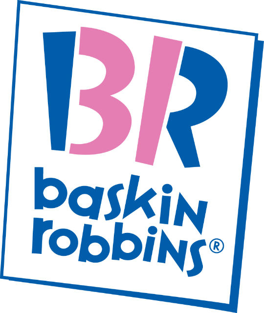
Baskin Robbins, like most ice cream places, projects a sense of fun with their stores and products (like flavors named “Love Potion.”) Their logo uses a playful font to clearly show “B R” for Baskin Robbins, but there’s also a hidden message. The pink shading it also shows “31” for their original 31 flavors of ice cream.
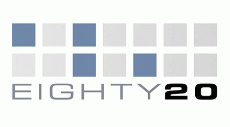
3. Eighty 20
Eighty 20 is a niche consulting company based in South Africa. They specialize in data analysis, making their logo even more impressive. At first glance it seems to just be random blocks, but if you take blue block as a ‘1’ and each grey block as a ‘0,’ their logo becomes binary for 80/20. This design cleverly and succinctly let’s you know what the company is about–using data in a unique, creative way.
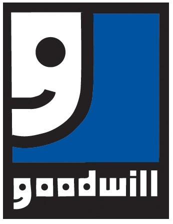
4. Goodwill
Goodwill is all about helping those less fortunate happy by providing gently used clothes and other items at deeply discounted prices. For many people, it brings a smile to their face. Notice the shape of the face and then look at the shape of the ‘g’ in “goodwill” and you’ll see that smiling face is represented twice.
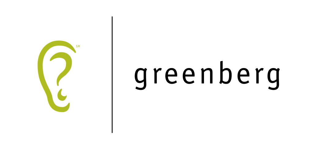
Greenberg Brand Strategy is a global research and strategic consulting company. They “listen to” (do research on) everything that’s being said about a company, use that to generate questions for the brand to think about, and then work with them to find answers and take action. All of that is represented in their simple logo showing an ear, where a question mark is the inner part of the ear.
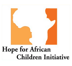
6. Hope for African Children Initiative
The Hope for African Children Initiative is a pan-African effort created to help children who have been orphaned by AIDS or who have parents who are sick or dying from AIDS related illnesses. Their logo shows at first glance the African continent in the negative space, but what makes the shape of it? The outline of an adult and child, who the Initiative is trying to help bring together.
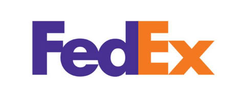
7. FedEx
FedEx is a well-known delivery company that is always moving. The logo seems normal at first, but notice the whitespace between the ‘E’ and ‘x.’ The arrow symbolizes that they are always on the go and moving forward.
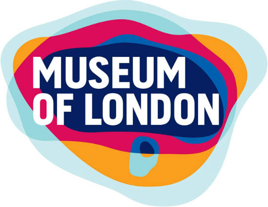
The Museum of London is, well, a museum in London. One that shares the history of the city. Though the background colors in their logo look random, they actually represent the geographic area of London and how it has changed over time. Even in the logo, the museum is holding true to it’s mission.
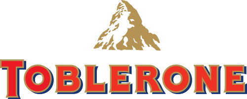
9. Toblerone
The logo for Toblerone pays homage to it’s history in two ways. The first is the image of Matterhorn mountain, part of the Swiss Alps. The second is the hidden bear in the mountain, which honors the fact that the sweets were founded in Bern (Bear), Switzerland.
10. Tostitos
When you think about Tostito’s chips, you often think about a party and sharing them over some salsa with friends… or at least that’s the equity of the brand. You see it in their TV commercials and print campaigns–Tostito’s means fun with friends. Their logo incorporates that same idea: the two ‘t’s are eating dip out of the tittle of the ‘i.’
